Is Your Website Responsive?

This is one part of a multi-part series on a “Layman’s Guide to Developing Your Website for Small Businesses, Entrepreneurs, Philanthropists, and Non-Profit Organizations.”
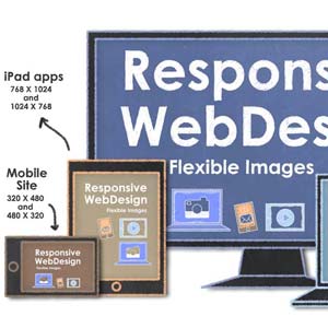
Having a responsive website will be the most important step you can make to ensure your website is not outdated. As of this writing an overwhelming percentage of websites are being viewed on mobile devices such as iPads, tablets, iPhones and Androids.
Basically, responsive means that as the device changes, the web page changes to look good on each device. Responsive sites change yet the experience of the website remains.
Sometimes the coding going into a responsive site needs to change slightly for mobile viewing, although the entire site and the experience is the same on all devices and responds to the size of the screen by adjusting accordingly. A good web developer would know when to make code changes for various portions of the website.
For example here is a responsive site I finished making a few days ago:
http://www.marilynsvoiceforlife.org
Another type of responsive website is a single page site that makes it easier to scroll through the site with your finger on an iPad or mobile phone and click to your destination on the page when you’re on a laptop or desktop computer.
Here is a site I finished last week or so:
http://www.mylongislandcarservice.com/
You can view the website on various devices to see how it looks or you can take your browser page and make it smaller slowly by grabbing the bottom right corner with the mouse. Make sure your browser isn’t in “full screen” mode or you won’t be able to move it at all. You will see the information move around and resize itself automatically all the way down to a mobile phone without changing the quality of the site.
If you haven’t started your website yet, then make sure it is a Responsive Site when you do. If you have an existing site, then contact your web developer and make sure your site works well on all devices without losing the quality of the experience.
Artfully Yours,
Kolleen Shallcross